Client
EIVEE
Areas
Services
EIVEE (formerly known as Skarde®) is a procurement solution that aims to simplify the procurement decision-making process. EIVEE needed a new contemporary identity, name and website design to differentiate itself from its competitors to promote tech-enhanced sustainable and strategic procurement.
Challenge
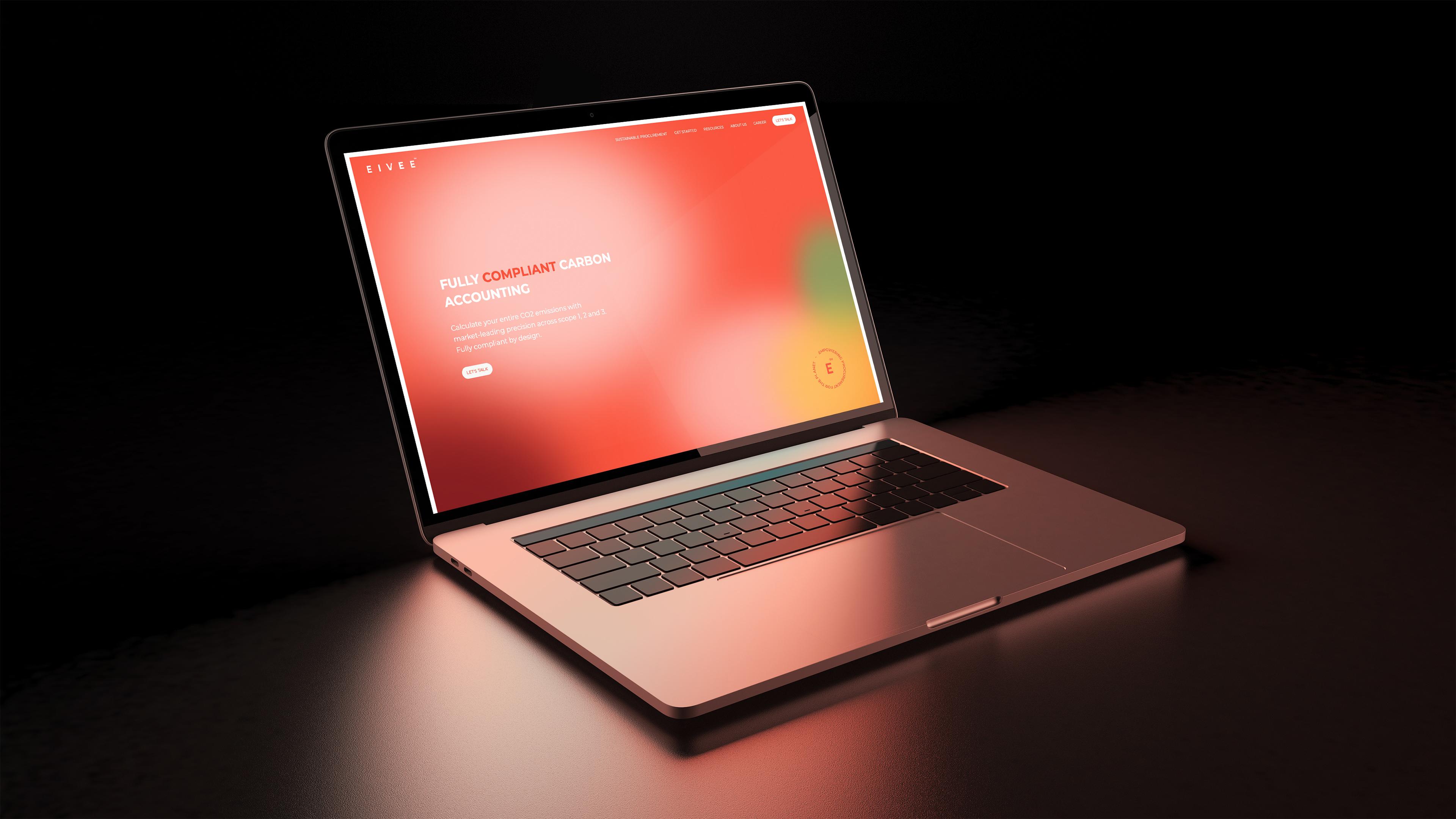
EIVEE’s challenge was that its brand appearance didn’t match its modern and tech-savvy company. They wanted to launch a new website to clearly visualize their product, competencies and USPs to rebrand themselves. The website should target potential customers, investors, and employees.
Insight
In the early stage of the project, we discovered that EIVEE needed a new name to kick off the rebranding. Their former name, Skarde, is an old Viking name and did not work well internationally.
Furthermore, we discovered that there was an unleashed potential in the digital identity of Skarde(now EIVEE), as it was a bit old-school and didn’t differentiate from the competitors.
From a deep inspection of the website, we concluded that the information structure needed a tweak to ease the user journey and make the key messages stand out.
Solution
Based on our insights, we concluded that the solution was to rebrand EIVEE with a completely new name, visual identity, and website.
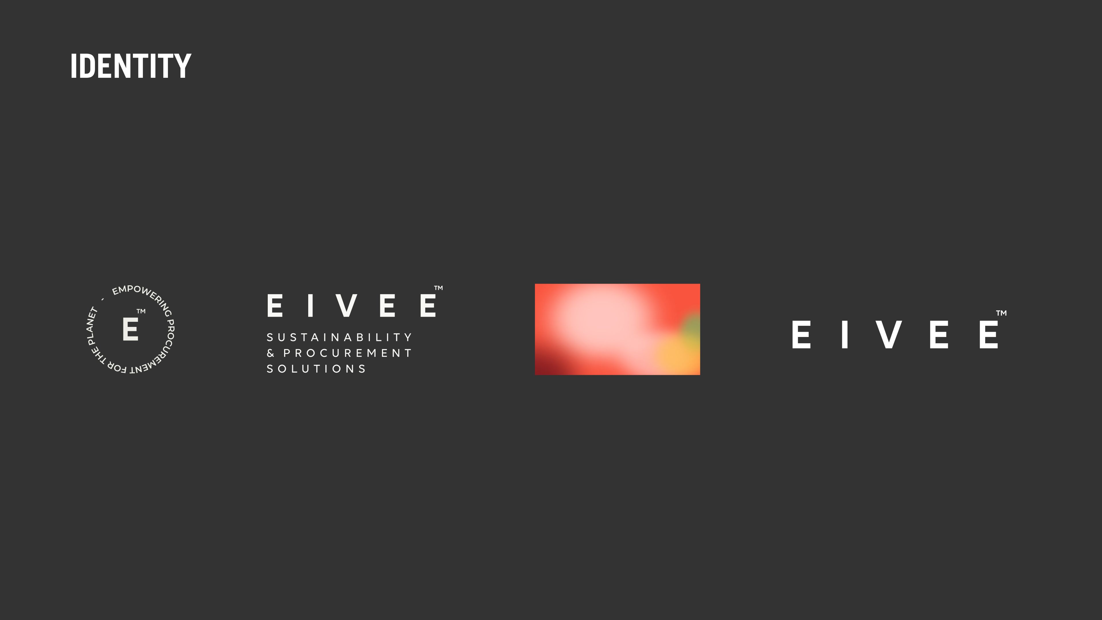
The first step of EIVEEs new identity was to rename the brand. Through workshops, we came up with the name EIVEE. The name originates from the Ivy plant, which can grow anywhere; therefore, EIVEE is a great symbol for a company that specializes in creating growth for any client anywhere.
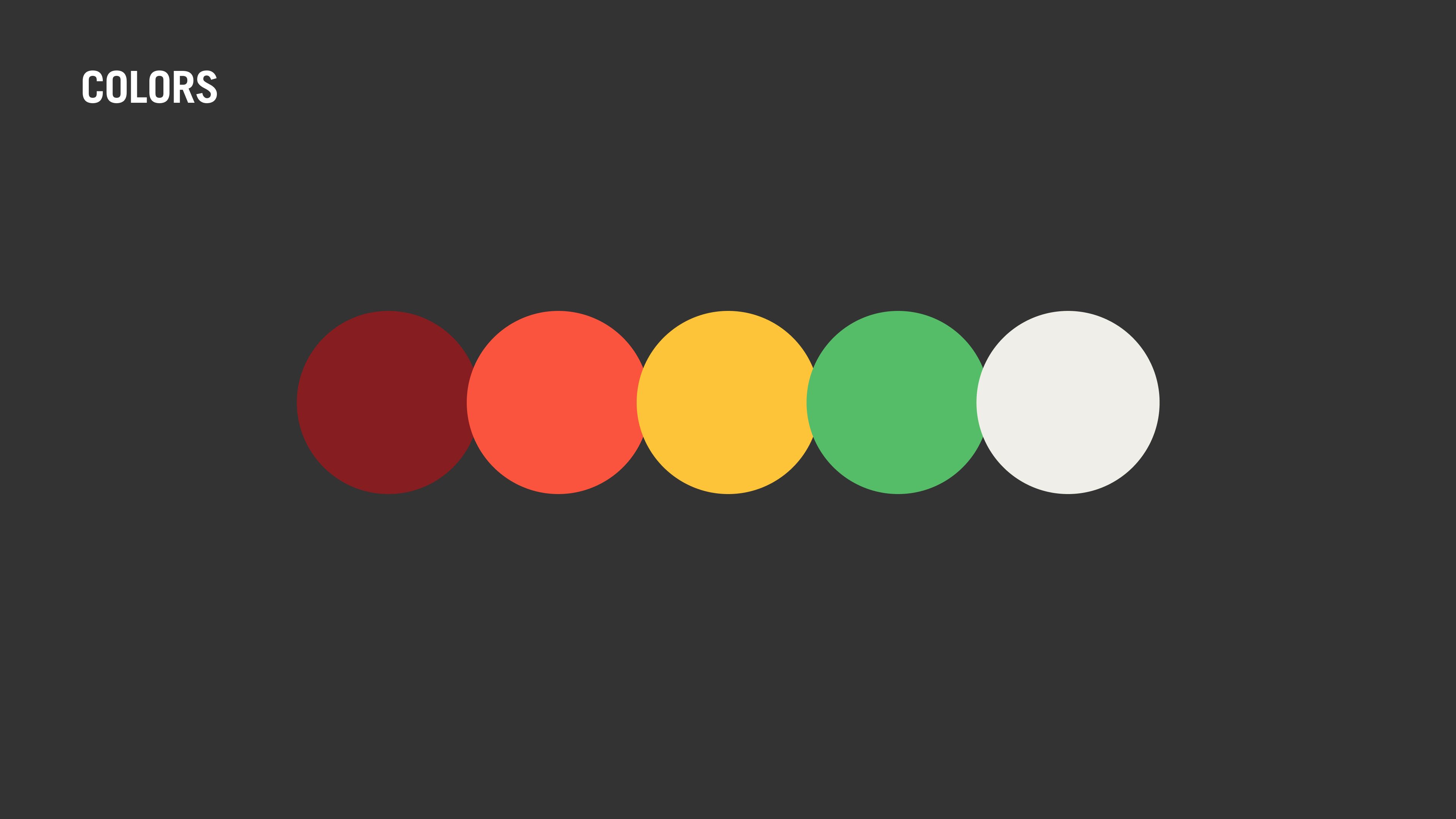
The second step was to create a new digital identity to match the name, EIVEE. This step included a new logo, fonts, warm and bright colours, and a refreshed photo style.
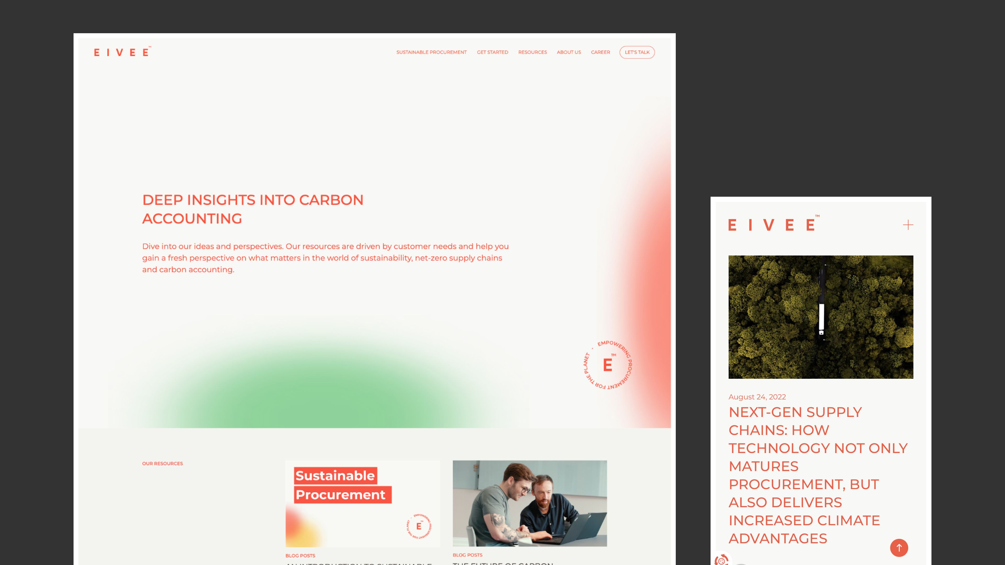
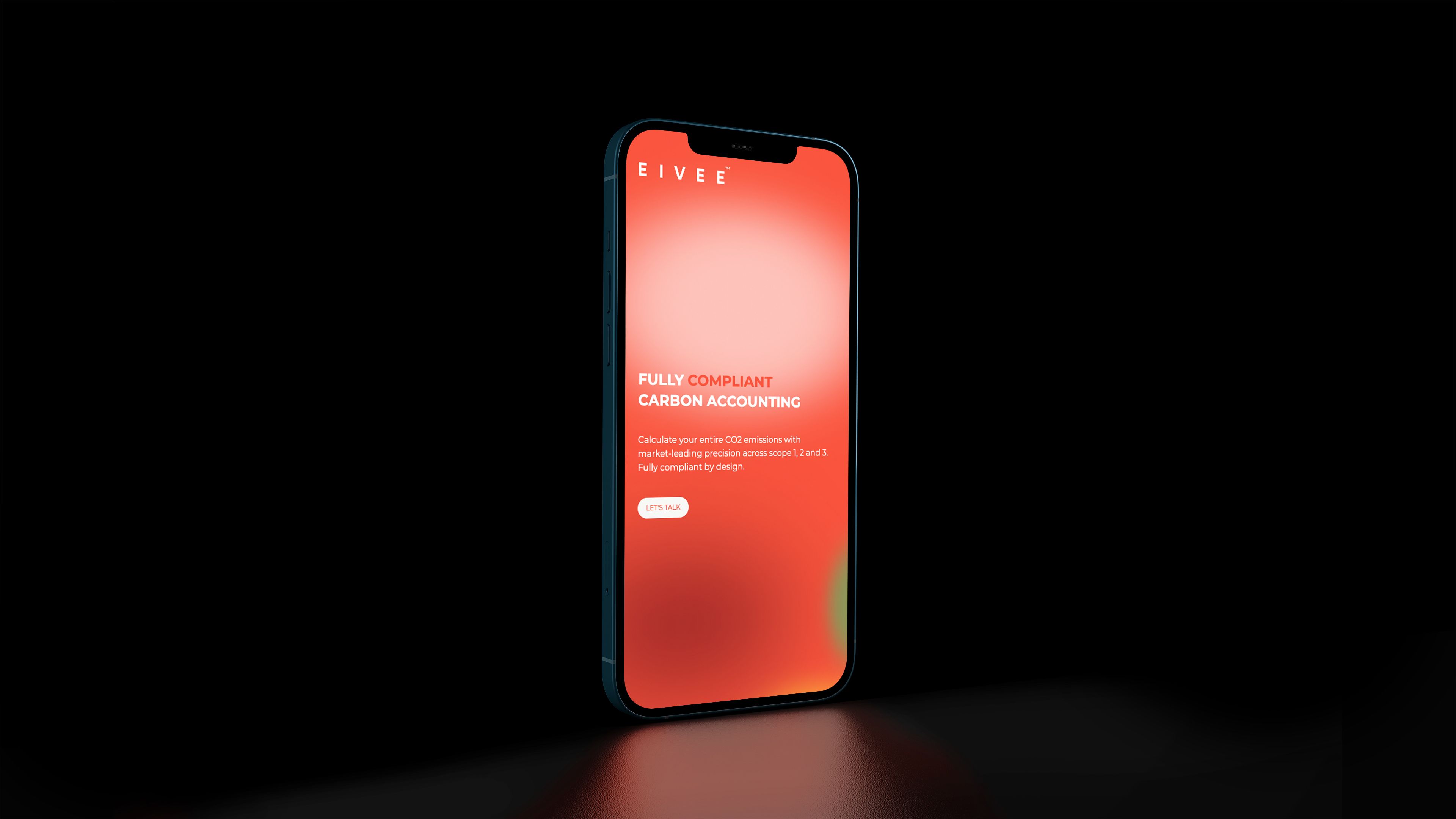
The final step was to make the new identity come to life with a redesigned website. By focusing on the user journey and the information structure, the website now guides the user on the solution offered, how to get started and whom to contact with subtle interactions and animations to enhance the user’s experience.
Go explore: EIVEE

CASE STUDY